Para español, leer debajo de la imagen…
We would like to thank “d+a” for their interest in our work!
The text below is an excerpt from the publication. For the full article/ publication, please refer to the source indicated below.
Geometric Diorama
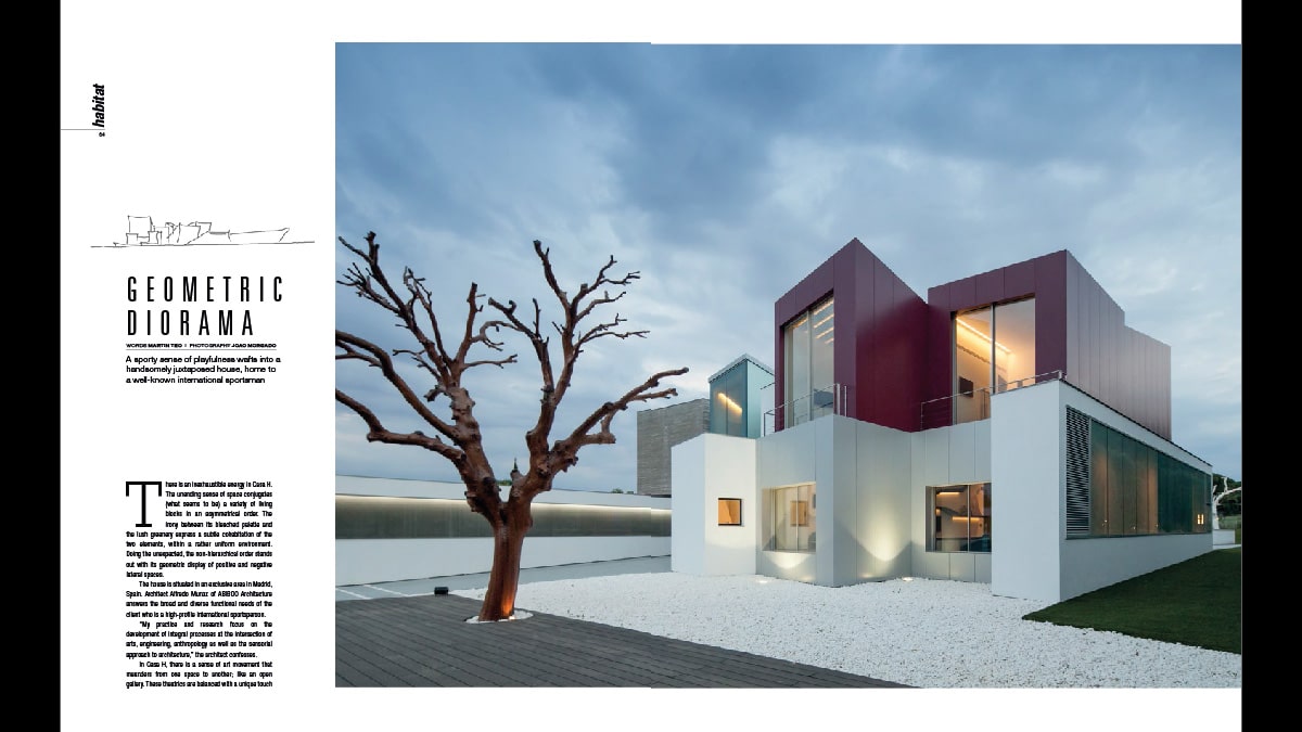
A sporty sense of playfulness wafts into a handsomely juxtaposed house, home to a well-known international sportsman.
There is an inexhaustible energy in Casa H. The unending sense of space conjugates (what seems to be) a variety of living blocks in an asymmetrical order. The irony between its bleached palette and the lush greenery express a subtle cohabitation of the two elements, within a rather uniform environment.Doing the unexpected, the non-hierarchical order stands out with its geometric display of positive and negative lateral spaces. (…)
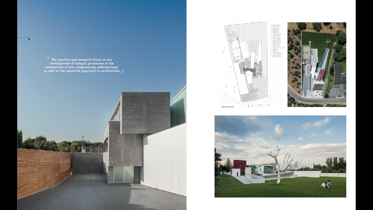
“My practice and research focus on the development of integral processes at the intersection of arts, engineering, anthropology as well as the sensorial approach to architecture,” the architect confesses.
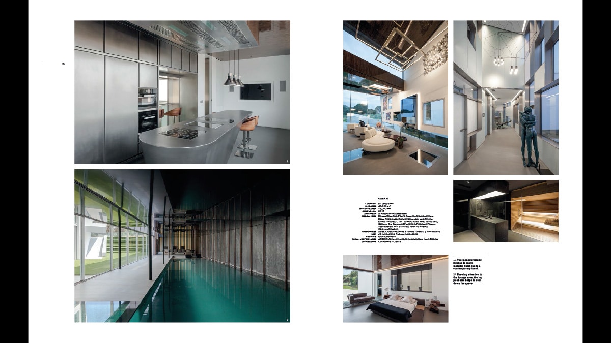
In Casa H, there is a sense of art movement that meanders from one space to another; like an open gallery. These theatrics are balanced with a unique touch of contemporary style that gives out a minimalistic look. But in that organised mannerism, its ‘soul’ is present. Every corner of the house tells a different story and narrates a distinctive mood altogether. It is hard to point out a favourite spot because ever corner is unique on its own.
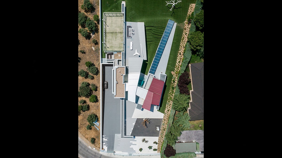
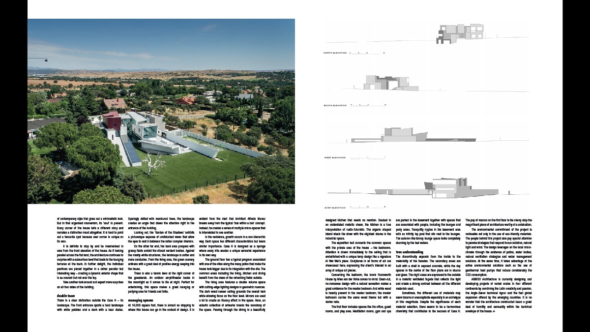
It is definite to stop by and be mesmerised in awe from the front elevation of the house. As if looking parallel across the flat land, the architecture continues to surprise with a subsurface level that leads to the lounging terraces at the back. In further delight, the individual pavilions are pieced together in a rather peculiar but interesting way – creating a dynamic exterior shape that is au courant but not over the top. Take another look around and expect more surprises on all four sides of the building.
Double team
There is a clear distinction outside the Casa H – its landscape. The front entrance sports a hard landscape with white pebbles and a deck with a bear statue. Sparingly dotted with manicured trees, the landscape creates an angle that draws the attention right to the entrance of the building. Looking out, the ‘Garden of the Shadows’ exhibits a picturesque expanse of undisturbed views that allow the eyes to rest in between the rather complex interiors. On the other far end, the back area prospers with grassy fields amidst the vibrant verdant bushes.
Against the mostly-white structures, the landscape is softer and more conducive. From the living area, the green scenery enlivens with a great deal of positive energy seeping into the house.
There is also a tennis lawn at the right corner of the grasslands. An outdoor amphitheater basks in the moonlight as it comes to life at night. Perfect for entertaining, this space makes a great lounging or partying area for friends and folks. (…)
True understanding
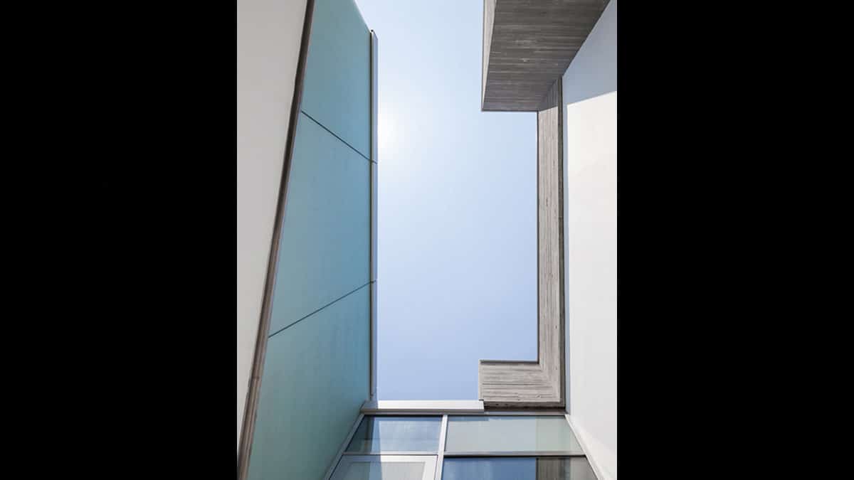
The discontinuity expands from the inside to the materiality of the facades. The secondary areas are built with a shell in exposed concrete, while the day spaces in the centre of the floor plans are in stucco and glass. The night areas are expressed to the outside in a metallic ventilated façade that reflects the light and create a strong contrast between all the different materials used.
Sometimes, the different use of materials may seem bizarre or unacceptable especially in an archetype of this magnitude. Despite the significance of each material selection, there seems to be a harmonious chemistry that contributes to the success of Casa H. The pop of maroon on the first floor is the cherry atop the magnificent piece of architecture worthy of a celebration. The environmental commitment of the project is noticeable not only in the use of eco-friendly materials. (…)
ABIBOO Architecture is currently designing and developing projects of varied scales in four different continents by combining the Latin creativity and passion, the Anglo-Saxon technical rigour and the fast global expansion offered by the emerging countries. It is no wonder that the architecture constructed bears a great deal of humility and sensuality within the technical
envelope of the house.
The copyright of photos, images, videos, and ideas indicated in this Think Tank section belong to each artist/ creative studio/ company mentioned or referenced in the links below.
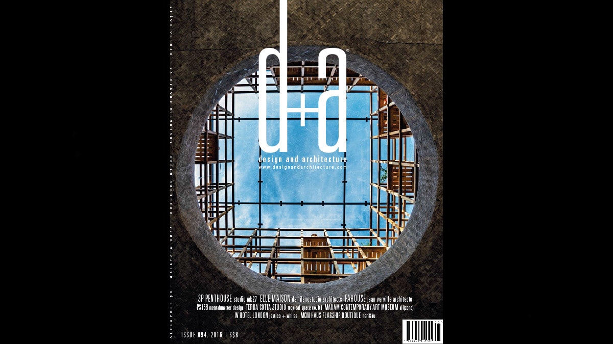
¡Nos gustaría agradecer a “d+a” por su interés en nuestro trabajo!
Diorama Geométrico
The text below is an excerpt from the publication, but it is only available in Spanish. Sorry for the inconvenience.
Los derechos de autor de las fotos, imágenes, videos e ideas mostrados en esta sección pertenecen al correspondiente artista/ firma creativa/ empresa mencionada o referenciada en los correspondientes links indicados a continuación:
Source/ Fuente: d+a design and architecture. Issue 094.2016. Editorial: Martin Teo. www.designandarchitecture.com


